1

Well there's a much better and complete iphone app called six to eight by Adam Wright here: Six to Eight: An iPhone client (discontinued)

(NB: this post did have an app but well, it was useless)

6
  • 1
    My understanding is that you should NOT copy the stackoverflow 'look and feel' which generally means things like colors/icons/layout. To me, this looks almost identical to the main sites and could easily cause confusion that is the 'official SO app'.
    – swanson
    Commented Jun 1, 2010 at 22:12
  • The green block look doesn't translate well to mobile devices or small screens.
    – Chris S
    Commented Jun 1, 2010 at 23:17
  • yea, the whole UI is meh. Especially the left side. The right side looks too "busy"
    – Matt S.
    Commented Jun 2, 2010 at 0:50
  • I'm not a UI designer :) so please suggest a better layout! This is more about learning Objective-C for me than it is about creating a SO app, but both would be great.
    – Jonathan.
    Commented Jun 2, 2010 at 7:44
  • I've just removed the favourites star and count, I hadn't been sure to add it as it's not useful and not on the main site. I'd like to keep the number of views and votes as they give an idea of how good/popular the question is.
    – Jonathan.
    Commented Jun 2, 2010 at 7:52
  • rearrange the username label. Where it is isn't the best. It seems to be just sitting there. Move it to below the title, but be sure to say "asked by" or something like that
    – Matt S.
    Commented Jun 2, 2010 at 19:01

3 Answers 3

4

The "Stack" in the name is okay. As long as your app don't sound like or look like it is owned by or endorsed by Stack Overflow Inc., you're good.

• Do name your application with something unique. Including one of the terms, "Stack" or "Exchange" or "Overflow" in your product name is generally okay.

It looks okay to me, too because no reasonable person would think they are using Stack Overflow. It looks like an application tailored to the device, and that's the point. The API is designed to create diverse apps to make them really kickass your specific platform. If you stay away from just cloning the site or looking like you're an official Stack Overflow application, you're good.

2

I strongly suggest reading the iPhone Human Interface Guidelines (available on the dev portal) as well as researching the ways in which similar successful apps display their data.

There's nothing better than apps that have had effort put into their user interface, both in terms of intuitiveness and polish. Especially on an Apple operating system.

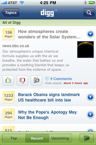
The mock up you have made is poor (as anything more than a layout idea) compared to some of the quality user interfaces available, such as the Digg app. I would use that and others as inspiration. Not only for layout, but also visual polish.

I almost feel inspired enough to boot up Xcode again :-P

3
  • Could you say more specifics? Is it the gap under the title, that makes it look like the cell is too big? I was going to put small UILabels with the question's tags there. The left hand side Answers/Votes box I based on the digg app, but didn't want to copy it directly.
    – Jonathan.
    Commented Jun 4, 2010 at 7:50
  • There needs to be some bolded text in there somewhere. First choice would be the question title. The extraneous information such as username etc should be a grayish color. If you're going to have the votes box in there, the question title needs to at least be in line with the top. There's many things that make your mock up flat and unpolished. The votes box for example could be more than just a flat rounded rectangle. Or it could take up the whole height to make a pseudo two-column table. Commented Jun 6, 2010 at 22:26
  • In other words, on the iPhone you have to go to lengths to polish the visual look and layout of your UI to be on par with the successful apps. If you can't see what's "better" in these apps then it might be time to get yourself a GUI designer. Commented Jun 6, 2010 at 22:29
2

Have you seen the Digg.com official iPhone app? You could take some inspiration from that in terms of custom UITableViews.

Here's an example - just showing the title and the vote count would be enough in my view, then expanding the row displays more information such as

  • The user
  • Date
  • Number of answers.

Obviously the thumb icons would go.

alt text

1
  • looks good though I'll keep the answers on the unexpanded cell as I know that I personally look at that to see if I should bother opening a question, if I want to to know the answer to the question but see there's no answers I won't bother looking in it then. And if I think I can answer the question and see it's already been answered then I don't really bother either. Also the tags are somewhat useful, if the title is like "How do I split a string?" the tags say what language it is.
    – Jonathan.
    Commented Jun 2, 2010 at 16:26

You must log in to answer this question.

Not the answer you're looking for? Browse other questions tagged .