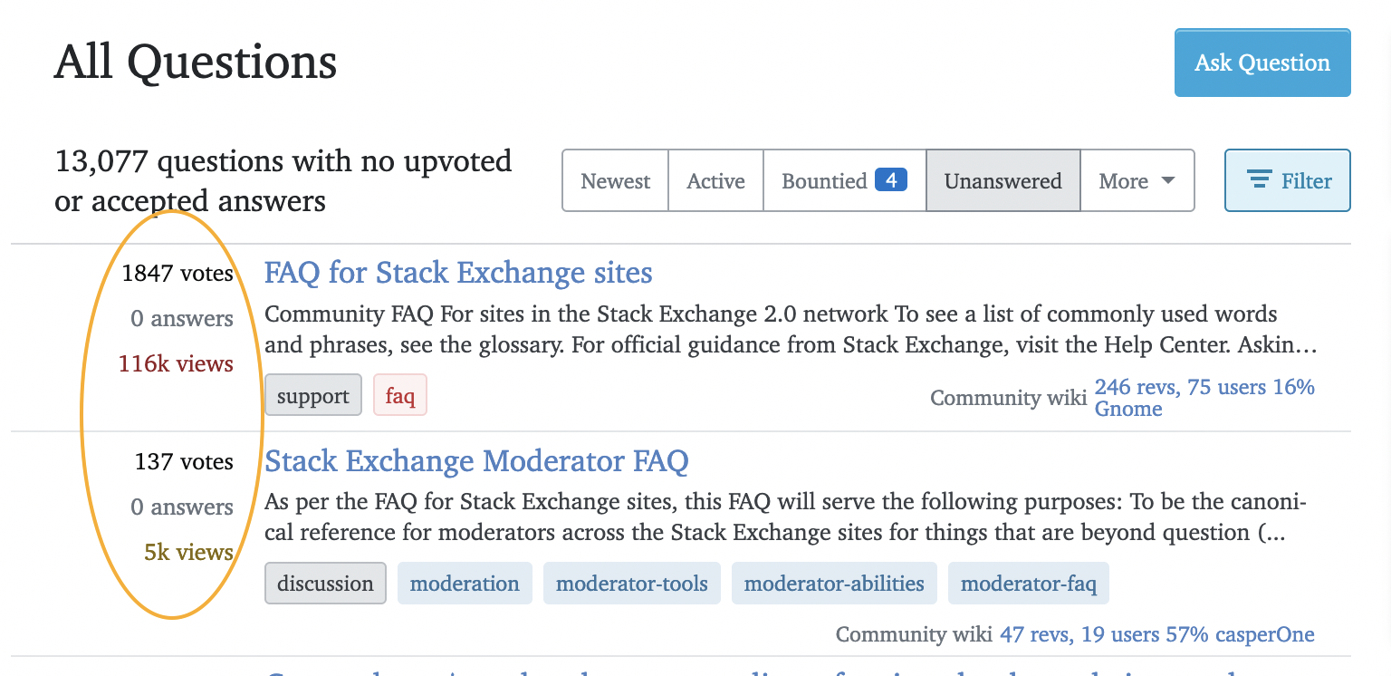
I would like to make a user script to disable the responsiveness on Stack Exchange sites. My main reason is that I would like to resize my browser to half my screen size (705px) and still get the question list in the normal layout with the question statistics (votes, answers, views) on the left site and not at the top:
I looked into the CSS file and I think the problem start when the pages become narrower than 816px. So I tried to modify this answer https://stackoverflow.com/a/18928044 to the following user script:
// ==UserScript==
// @name     disable responsivness
// @match    https://meta.stackexchange.com/questions/*
// @require  http://ajax.googleapis.com/ajax/libs/jquery/1.8.3/jquery.min.js
// @grant    GM_addStyle
// @grant    GM_xmlhttpRequest
// ==/UserScript==

var badCSS = $("link[href*='global-cdn-']");
var badURL = badCSS.attr ("href");

badCSS.remove ();

GM_xmlhttpRequest ( {
    method:     "GET",
    url:        badURL,
    onload:     function (rsp){
        var betterCSS = rsp.responseText.replace (
            /max-width:816/g, "max-width:100px"
        );

        GM_addStyle (betterCSS);
    }
} );
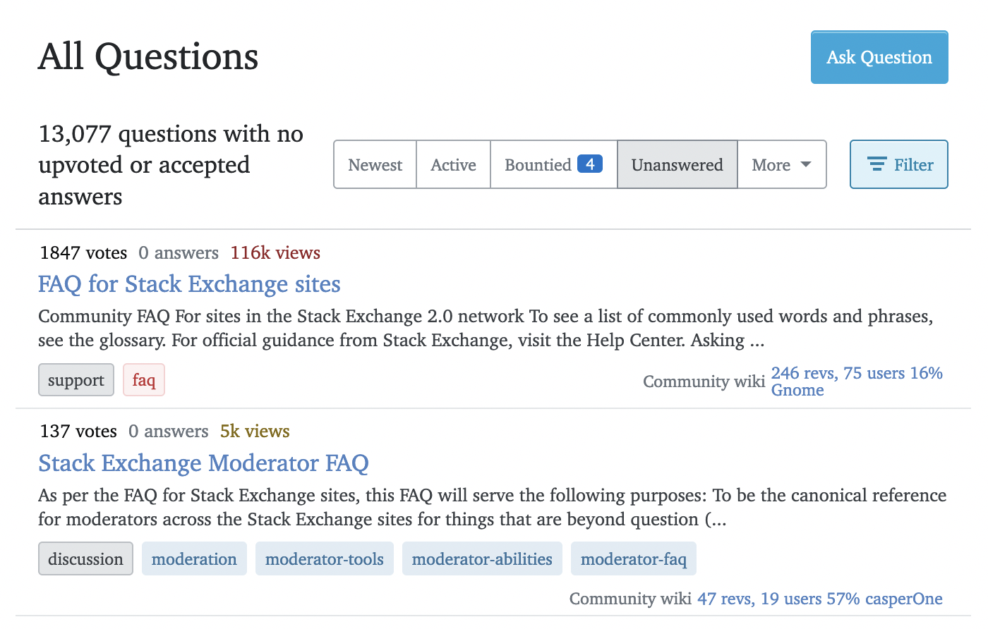
However I still get this layout:
Anybody knows how to fix this?
Browser: Firefox 102 ESR Userscript manager: Tampermonkey 4.18


StackExchange.responsive. You'll need to reverse engineer the breakpoints which get added and/or block the breakpoints from being added withStackExchange.responsive.addBreakpointListener().