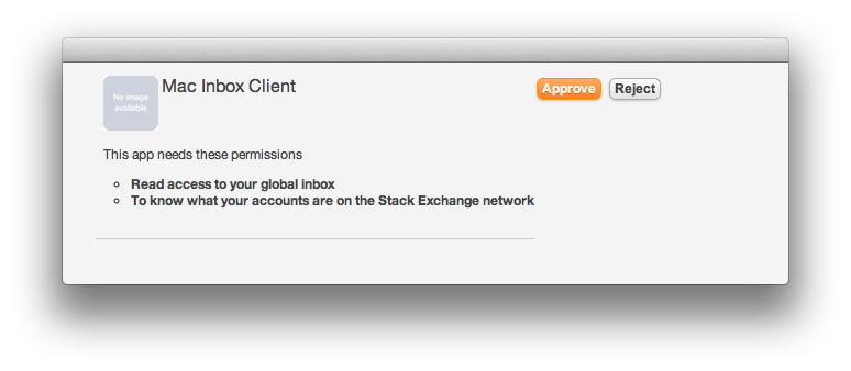
The auth dialog (client side) could do with a bit of improvement.
Specifically, showing the currently logged in user, and a link saying "not you?". Facebook does this and allows you log in as someone else. It's also reassuring to know that it knows who you are.
Also the buttons seem a bit disconnected on the right of the description/etc. On the server side flow they are below the text/line.
Also there is a fair bit of whitespace on the left of the dialog (below screenshot shows a window which resizes to fit the content, it works perfectly on all other pages)

