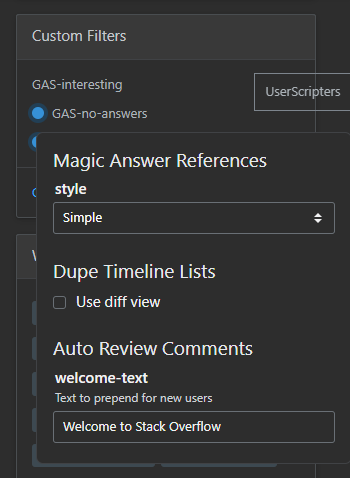
Screenshot

About
UserScripts Configurer is a shared configuration controller for UserScripters' userscripts.
How to use
Configurer is exposed as a global accessible via UserScripters.Userscripts.Configurer.
To ensure the Configurer is done loading, including scripts are encouraged to listen to a userscript-configurer-load event on unsafeWindow before hooking:
unsafeWindow.addEventListener("userscript-configurer-load", () => {
    // it is safe to hook into the configurer now
});
To hook to the Configurer, call its register method with the name of the userscript as its first parameter:
const configurer = UserScripters.Userscripts.Configurer;
const script = configurer.register("Auto Review Comments");
Since v1.6.0, the Configurer supports storage overrides if you pass a storage (either a userscript manager storage or a localStorage) as the second parameter to its register method.
If passed, the configuration will be stored in the corresponding storage instead of the in-built Configurer storage.
The method will return an instance of Userscript to which options (if any) can be added by calling its option method with 2 parameters. The 1st is the option's name, the 2nd is its configuration. The configurer currently supports 4 types of options (type field):
- text input
- checkboxes
- toggle switch
- select
If you want to ensure a Userscript or an Option is registered only once, both classes have a has method that accepts a name and returns a boolean:
// ensure the script hasn't been registered
if(!configurer.has("my-script")) {
    configurer.register("my-script");
}

// ensure the option hasn't been registered
if(!script.has("my-option") {
    script.option("my-option", { type: "text" });
}
Option config interface (as well as the interface of the Configurer itself) is described by our Global Types type definitions package.
// text input option
script.option(
    "welcome-text",
    {
        def: "Welcome to Stack Overflow",
        title: "Greeting text",
        type: "text",
    }
);

// checkbox option
script.option("prefer-diff-view", {
    items: [{
        label: "Use diff view",
        value: true
    }],
    type: "checkbox",
});

//toggle option
script.option("prefer-diff-view", {
    direction: "left", // aligns levers to the left of the title
    selected: true,
    title: "Prefer diff view",
    type: "toggle",
});

// select option
script.option("style", {
    items: [
        { label: "Simple", value: "simple" },
        { label: "Full", value: "full", selected: true }
    ],
    title: "Reference style",
    type: "select",
});
As of version 2.0.0, options can have disabled state conditions ensuring a given option can be dynamically disabled based on the values of other options.
To add conditions, pass a disabledWhen dictionary to the option config. The dictionary is keyed on option names with values corresponding to one of the options' values.
When the value of the option specified in the dictionary matches the one in storage, the option the dictionary belongs to will be disabled and vice versa otherwise.
An example option configuration looks like this:
// an option that will be disabled if 'prefer-diff-view' is false
script.option("dependent", {
    disabledWhen: {
        ["prefer-diff-view"]: false,
    },
    title: "Dependent option",
    type: "toggle",
});
Options can be added in bulk as a record of name-config pairs via the options method. An optional second parameter can provide shared config options:
script.options({
    welcome: {
        def: "Welcome to Stack Overflow",
        title: "Greeting text",
    },
}, {
    type: "text",
});
On value change, the Configurer dispatches a custom bubbling event on the registered script's container with the following detail:
interface ChangeEventDetail {
    name: string,
    script: string,
    oldValue: string | boolean | string[],
    value: string | boolean | string[],
}
The custom event can be listened to via the userscript-configurer-change event name:
window.addEventListener("userscript-configurer-change", ({ detail }) => {
    // do something with the change data
});
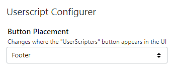
As of version 2.1.0, end users can configure where the button toggling the options modal will be rendered in the UI:

By default, the button is still displayed in the sidebar slightly above the expandable modal. There are 2 other options users can choose instead:
As an icon button in the top navigation bar

As a link button in the footer under the "Data" link in the "Stack Exchange Network" column

The Configurer uses a userscript manager-agnostic storage that also works with localStorage if manager storages are inaccessible.
License
The script is licensed under the GPL-3.0-or-later license.
Download
Latest version: 2.1.1
Platform
Version number means "last tested on":
| Chrome | Edge | Explorer | Firefox | Opera |
|---|---|---|---|---|
| ✔ 100.0.4896.127 | - | - | - | - |
Supported userscript managers:
- Greasemonkey
- Tampermonkey
- Violentmonkey
Contact
Author: Oleg Valter
Organization: UserScripters
Please, submit bug reports on the source repository.
Before adding a new one, please check if it hasn't been raised before.
You can also drop by to chat, we are a friendly bunch.
Code
Source code is written in TypeScript.
Contributions are welcome, you can always submit a PR here.
