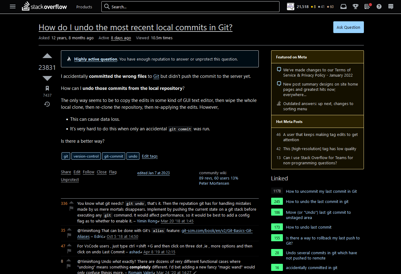
Stack Exchange introduced some excessive underlining in high contrast mode. This is visually very busy and overzealous application of underlines. Literally every link will be matched by their CSS, since the rule is for body.theme-highcontrast a - all links in high contrast themes.
This userstyle attempts to tone down the usage of underlines. Main points:
- Disabling underlines on elements that do not necessarily need it like lists of links or the tags.
- The underline itself is moved further from the corresponding text to make it more readable.
It also works on non-high contrast mode but mostly 2. would take effect there.
/* ==UserStyle==
@name         Stack Overflow undelines improvements
@description  Improvements for undelines. Mainly for high contrast mode but will work on other ones
@namespace    https://github.com/PurpleMagick/
@version      1.4
@author       VLAZ
@license      MIT
==/UserStyle== */

@-moz-document domain("stackoverflow.com"), domain("superuser.com"), domain("serverfault.com"), domain("askubuntu.com"), domain("stackapps.com"), domain("mathoverflow.net"), domain("stackexchange.com") {
    .user-details a,
    a.my-profile,
    a.js-products-menu,
    a.comment-user,
    a.post-tag,
    a.s-tag,
    a.badge-tag,
    a.badge,
    header.s-topbar a.s-navigation--item,
    a.s-btn__filled[href$="/questions/ask"],
    a.cancel-edit,
    .popup-close a,
    .uql-nav a.s-btn,
    .s-btn[href*="/users/edit/"],
    #products-popover a,
    #sidebar a {
        text-decoration: initial !important;
    }

    a,
    .s-btn__link {
        text-underline-offset: 2px;
    }
}


