My immediate feedback:
I’m not normally a fan of applications in place of browser interfaces (Slack is still in a tab for me), but this seems potentially quite useful. (With the usual caveat that my job is basically tied to activity on the sites.)
Switching to a new site required me to click the Google button again, but I didn’t need to use my password or 2FA, which is nice.
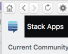
The hamburger menu can get lost in the top bar:

That can make it impossible to get the sidebar menu:

It’s awkward to type Markdown without preview. (If only we had CommonMark for this!)
The logo is too similar to the SO logo. Ideally, you’d be able to use our logo, but I don’t think that’s authorized. (See our trademark guidance.) My best suggestion is to use something like a question mark that indicates what you’re getting if you click on it, but doesn’t create the impression that it’s coming from Stack Exchange Inc. (I’m not a lawyer nor have I consulted one. This is just an immediate reaction.)
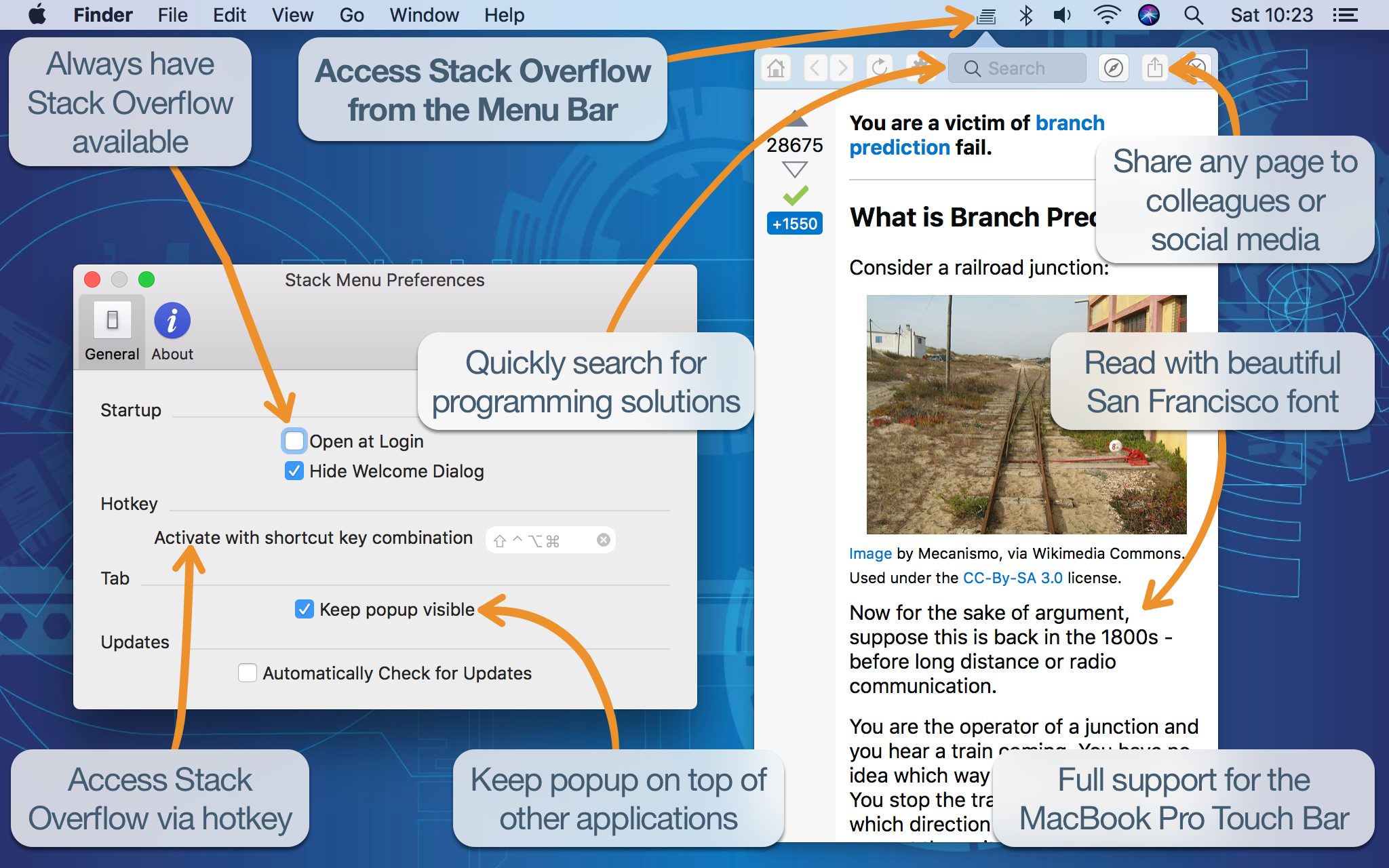
I love the way you’ve rearranged the layout, but I wish I could change the screen size and location.
At any rate, great job! I’ll be trying it out for a while and see if it sticks!


