About
Based on Use the same location for Submit button in the comment flag dialog as in the post flag dialog which asked for the buttons to go on the right side, and Question Close Updates: Phase 1 which moved all the buttons to the left side side instead, and removed the little box surrounding the number of remaining flags, I wanted to "fix it" with this script. It will:
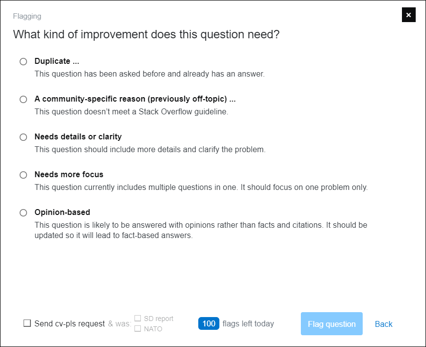
- Bring back the little blue box.
- Put the buttons back on the right side.
- Add elipsis to the options that will open op a new dialog.
- Make the apperance of radios, text, and size consistent.
- Applies to post flag, comment flag, and close vote dialogs both in and outside of reviews.
- Consistency also applies to the "Reject" dialog of suggested edits both in the queue and in-post tasks.
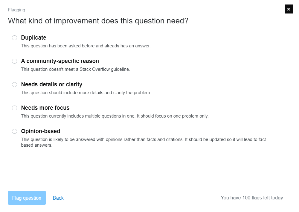
Screenshot
Before

After

The script is compatible with the "*-pls Request Generator" listed in the SOCVR Userscripts section:

Sites
The script only works for Stack Overflow, since adding the ellipsis is done depending on the option text, which is site specific.
Platform
Should work with any user script manager & any browser running JavaScript.
Tested using Opera with Tampermonkey.
Download
Contact
For bugs, please post here. Comments are fine too.
