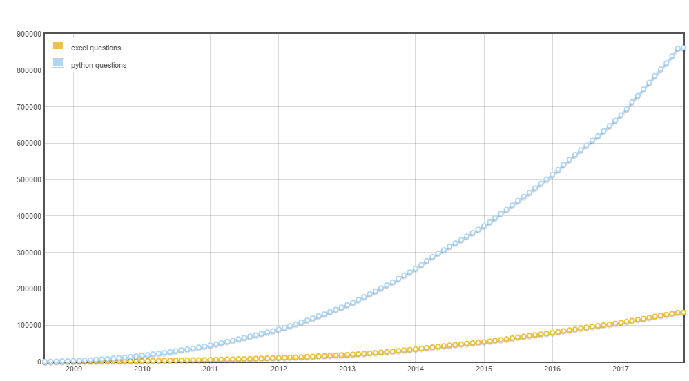
Do you mean something like this plot? :

(Generated by SEDE: /query/201360?ShowScore=0&Tag1=excel&Tag2=python&Tag3=NA&Tag4=NA#graph)
Use the data explorer (SEDE) for that.
To do this with the API, is possible but not pretty.
For example, to replicate the above plot you would need to make 111(Age of SO in months) API calls for python like this call, a then make 111 API calls for excel with the same time parameters. (Then piece the results all together and plot it.)
Due to rate limiting, those 222 calls would take at least 8 seconds. More tags, or finer time slices, increases the time proportionally.
Also, you are allowed 10,000 API calls a day, max. So that means, at most, 90 such runs per day -- including tests and development.
UPDATE:
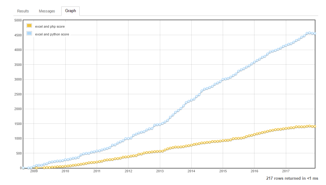
For comparing compound tags, EG [excel]+[python] vs [excel]+[php], this would become even more problematic in the API.
But, I forked the SEDE query into something that compares tag set A versus tag set B:
Right now it does 1 by 1, 1 by 2, 2 by 1, and 2 by 2 tag combos. But it should be obvious how to extend it for more tags on each side.

